Guess-the-album-cover
Last year, in early November, I needed to make some graphics for our upcoming anniversary sale (10 years!). I tried a few things, but didn’t find anything too inspiring, until one day I was trying to recreate a particular typographical effect that the midcentury designer Reid Miles often employed on covers he designed for Blue Note Records in the late 1950s and early 1960s.
What was the effect? As far as I can tell, Miles would cut the sides off of Franklin Gothic letters and then set the shapes — newly flat-sided on the right and left — extremely close together. It’s not a technique he employed often, and not one employed much by other designers since, I’d guess because it means visiting a particular kind of violence on letters that designers don’t usually feel free to modify. That is, the technique blurs the boundary between typography (the laying out of text with fonts) and type design itself (the designing of the fonts themselves).
So I tried to recreate the effect with coldtype, and I liked it so much I went ahead and recreated the entire cover of Kenny Dorham’s Trompeta Toccata, a Reid Miles design.
Then we put the design in a newsletter and thought, huh, maybe our customers will know what cover our design is based on?
Turns out, yes, you did! Not only were many of you surprisingly knowledgeable about midcentury album covers — one of you was actually an A&R rep at Blue Note!
So we kept doing it. (It is very fun to recreate iconic album covers.)
And maybe you were wondering which covers we were referencing?
Here are all our graphics paired with the real things.
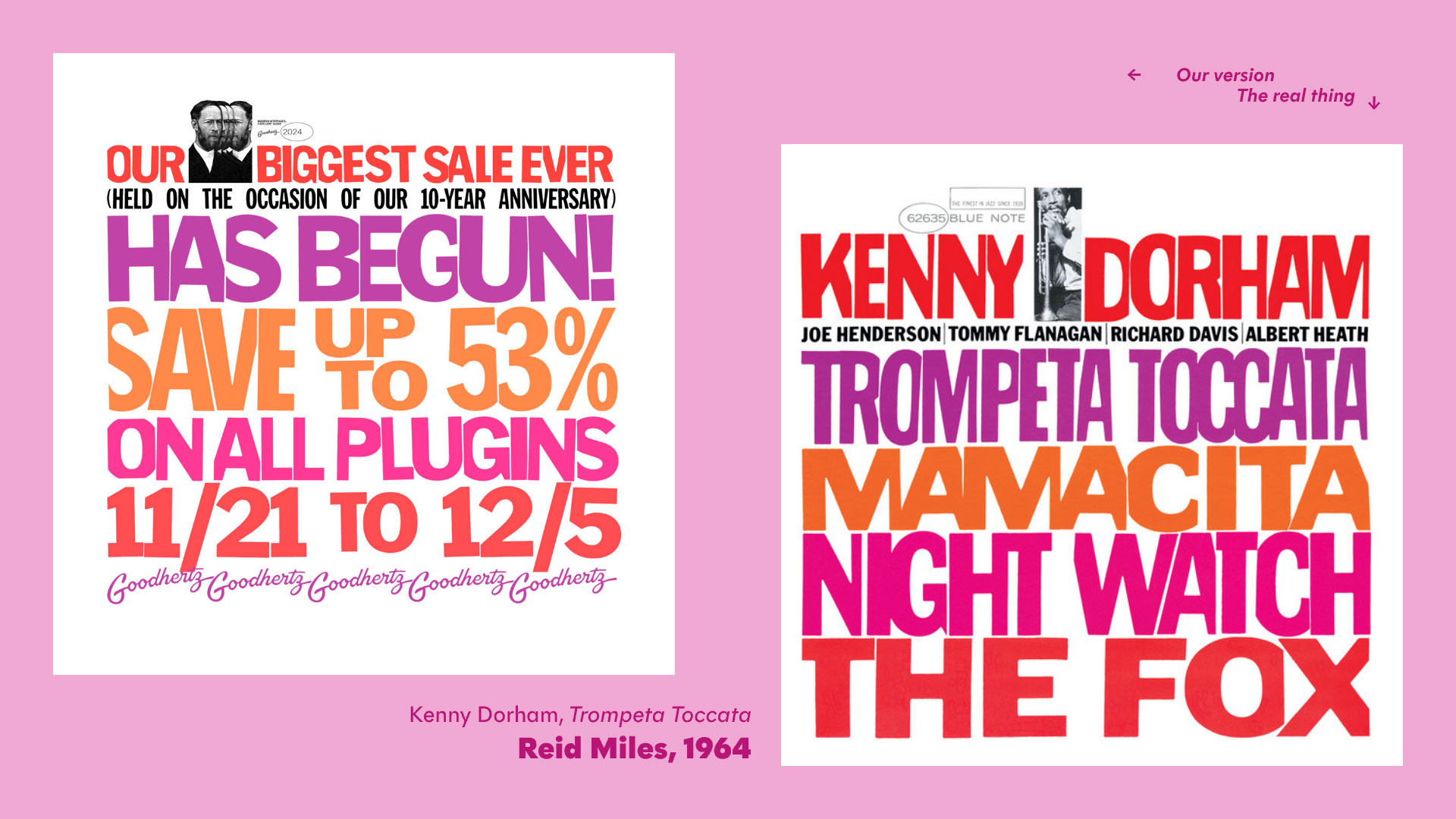
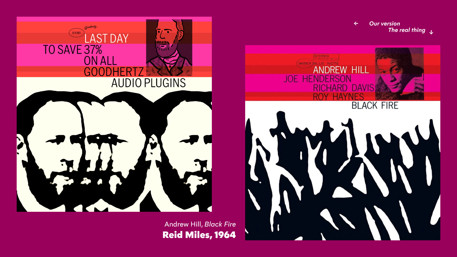
A Reid Miles design from the 1964 — our very first “recreated” album cover, selected because of the great chopped typography and also the sheer amount of text (since we always have lots of text to put in a sale graphic).
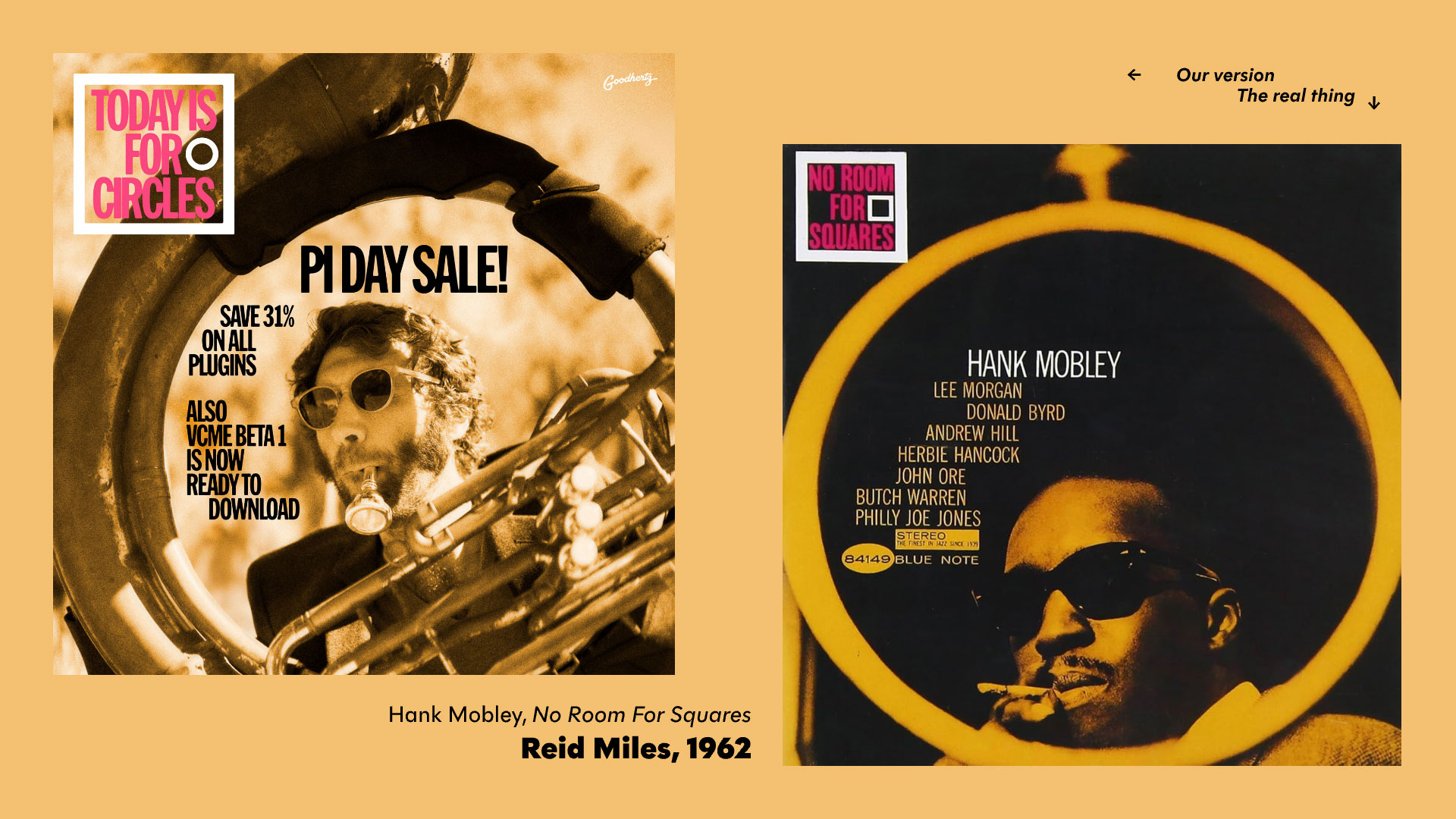
Another classic example of Reid Miles typography paired with an incredible photograph by Francis Wolff. You can see the original photo here. Pictured here (instead of Hank Mobley) is Jack Stratton with his latest acquisition: a sousaphone. We selected this cover for our Pi Day sale because of the great use of a circle.
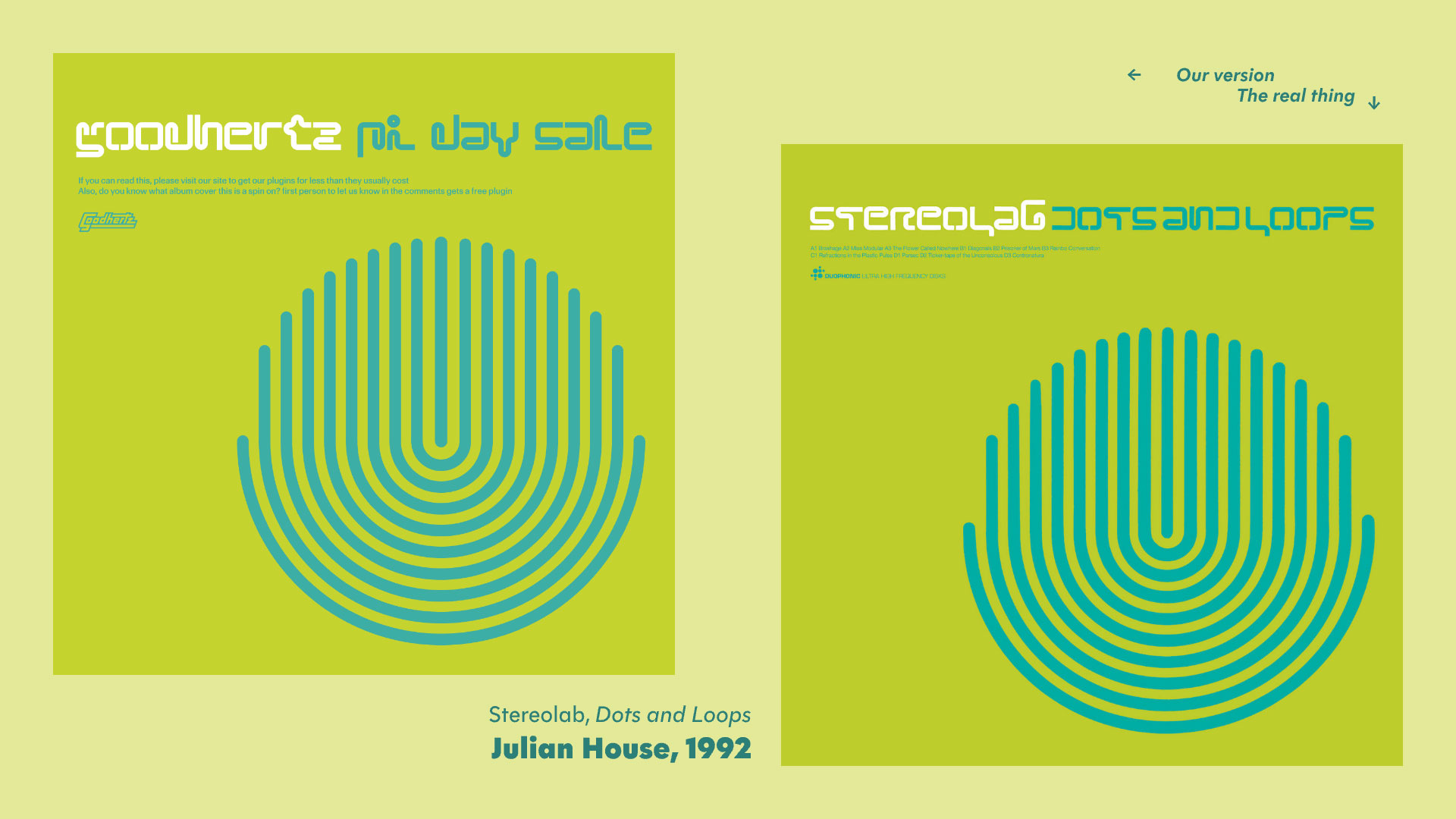
A great album with a great album cover: Stereolab’s Dots and Loops, cover design by Julian House (1992). Lots of great info about this iconic album cover on fontsinuse.com. Again selected for our Pi Day sale because of the prominent circular graphic.
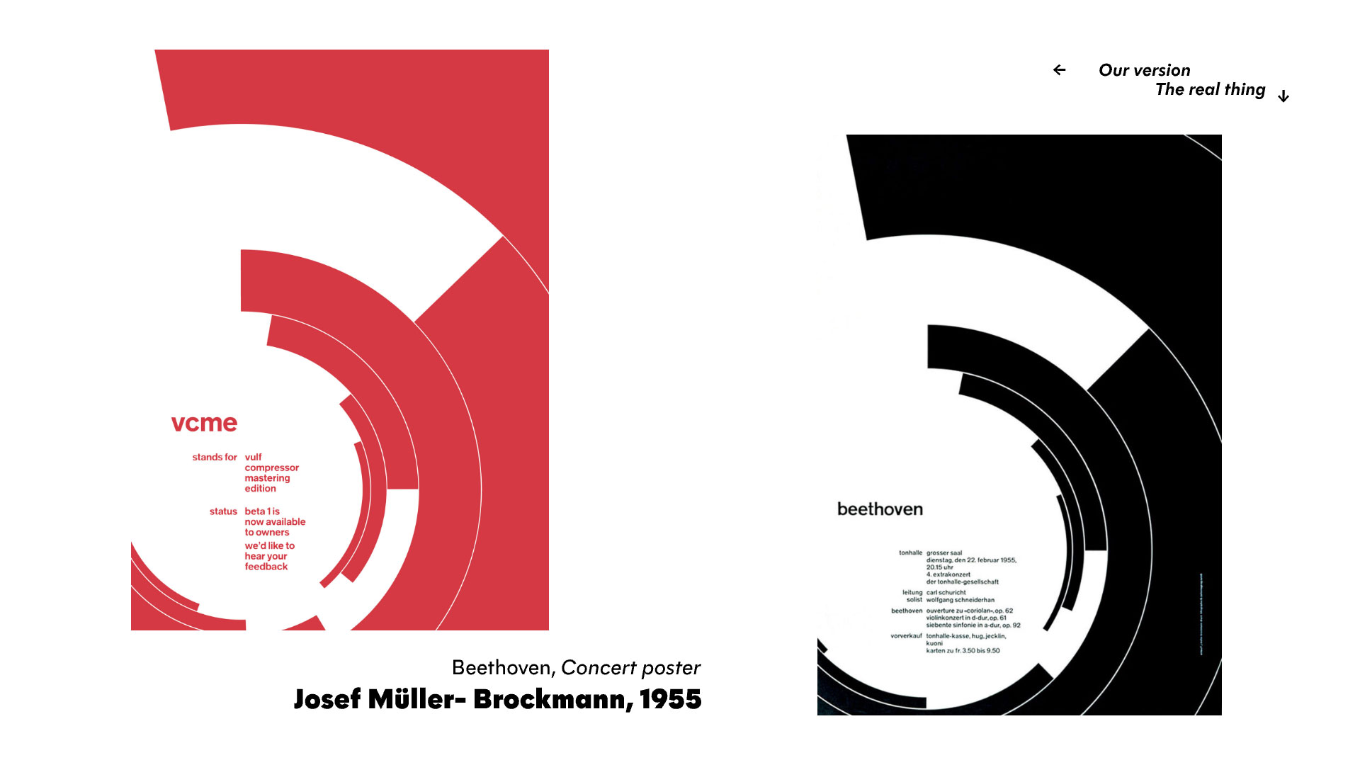
This one will be well-known (I believe) to most students of graphic design: Josef Müller-Brockmann’s Beethoven concert poster of 1955. You can read more about this graphic design classic here. Another circle choice for Pi Day. I’ll admit I don’t quite understand the lasting appeal this poster seems to have, especially since it’s often misconstrued as some kind of information design exemplar. (Unless I’m missing something… isn’t is just abstract?) I did really enjoy recreating it with code, though.
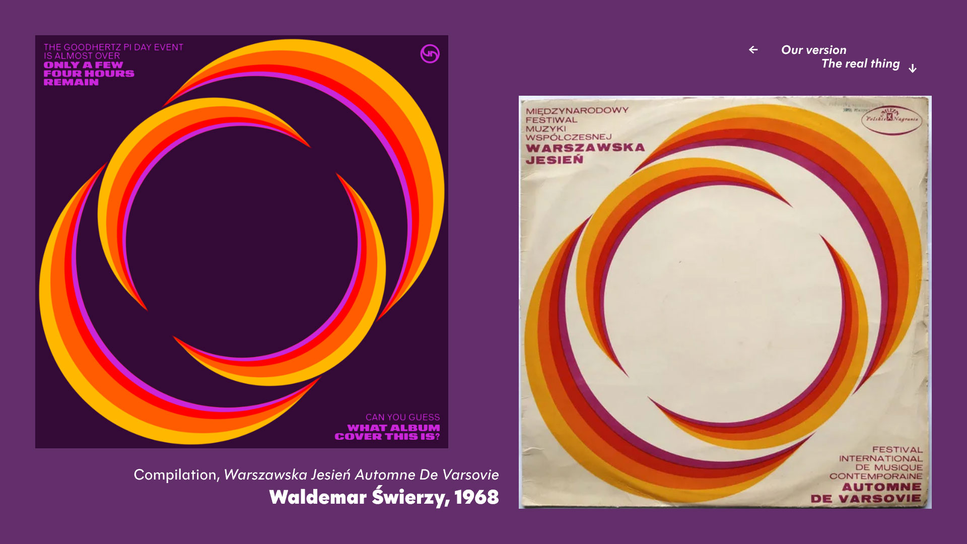
I found this one on the incredible Art of Cover Art substack, specifically this article. We selected this one, once again, because of the prominent circular motif, and also because we thought no one could get it. We even changed the background color so that Google Image Search couldn’t recognize it, but we failed to check Tineye, which — it turns out — did pinpoint the original. Which is fascinating, because our circular graphic and colors don’t exactly match the original.
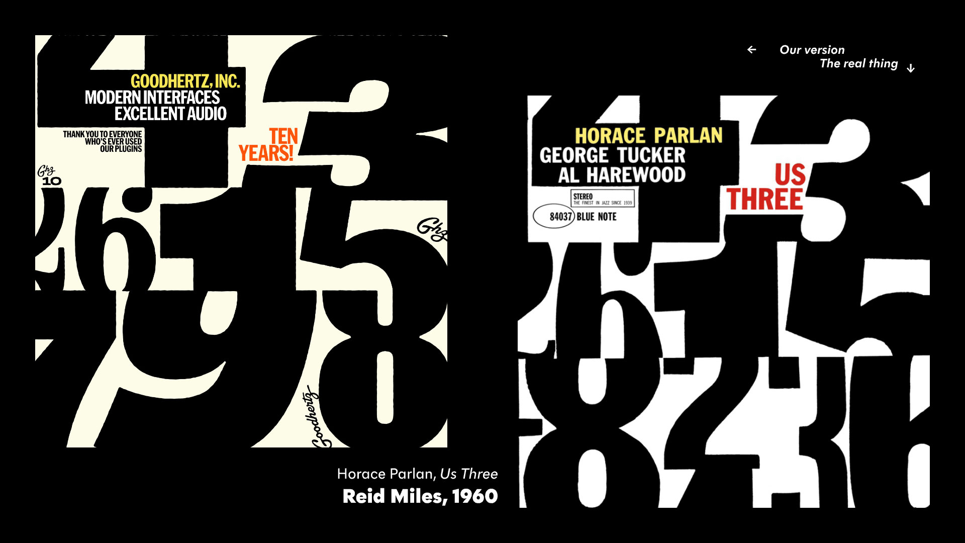
Another killer Reid Miles design, recreated using modern fonts.
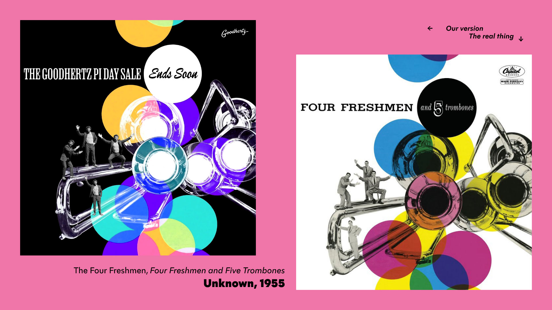
A classic goofy design. Did you notice Jack Stratton’s subbed in for all four of the freshmen?
Just a killer piece of graphic design, featuring — I’d imagine — an out-of-focus photograph blown up and rephotographed on high-contrast-film. Beautiful.