The shape-shifting letters of Tupe
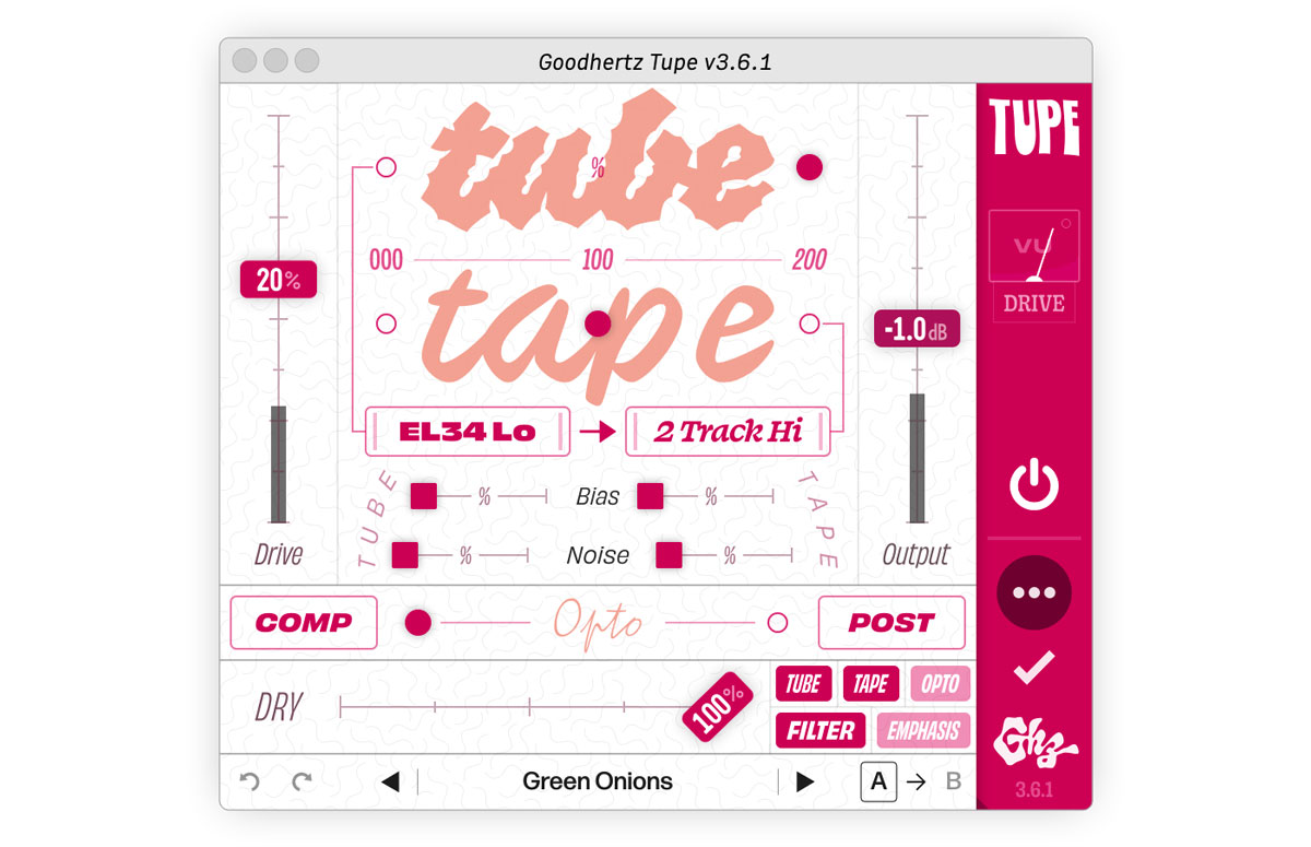
If you’ve tried out Tupe, you may have noticed two large words right in the middle of it: “tube” and “tape.” And when you change the values of the sliders on top of those words, you may also have noticed that the words themselves begin to change shape: the more tube you apply to the sound, the gnarlier the word “tube” gets in the interface; the more tape, the funkier “tape” becomes.
Usually our plugin interfaces rely on more scientific visuals to communicate what’s happening in the audio processing. From gain meters to goniometers to stereo-field visualizations, Goodhertz plugins have a whole suite of tools to help you understand how our algorithms alter your sounds.
But for Tupe, we wanted to try something a little different. Could we build a visualization that would help you understand the vibe of the effect? Usually this is only communicated through the design of the plugins. For instance, our vibier plugins always sport our surfy Ghz logo in the bottom of the sidebar, and the fonts chosen for each of our plugins’ interfaces attempt to give you an immediate visual sense of what each plugin has in store sonically. But because we tend to emphasize functionality over flair in our designs, the plugins can sometimes feel a little too flat, which led me to wonder: what if we put a huge variable font right in the middle of the UI?
That’s how I ended up emailing James Edmondson (of OHno Type Co.), to see if he could design a few glyphs as a proof-of-concept, and soon enough we had a little prototype:
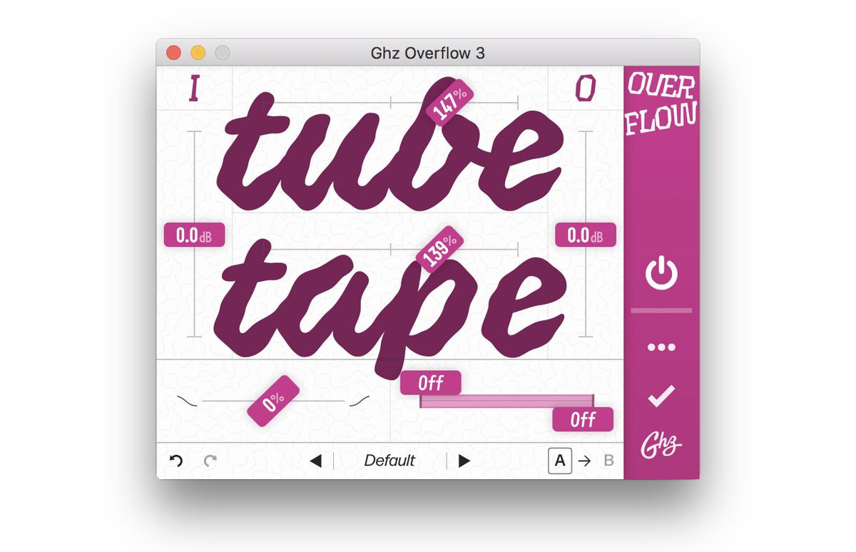
Yes, that’s Tupe, although back then (in early August 2020), the plugin was called “Overflow” and it had just a few controls in a slightly different configuration.
But when James sent over the variable font file, he gave that file a clever name: “Tupe.ttf” (to indicate some of the few letters in the font). I immediately changed the name of the plugin to Tupe, and the name stuck. Short & sweet & weird.
But we’re getting ahead of ourselves, as I’m sure many readers are wondering:
What is a “variable font”?
That’s a great question. Most fonts are static beings. You select a font in a dropdown menu, then type in an “a,” and that “a” will always look exactly the same (usually). Sometimes there is a bolder version of that same design that you can choose, or an italic version, or a combination of the two, but those are all different fonts, and there are always a finite number of them on your system.
But a variable font? Now that’s a shapeshifter. Select a variable font in a dropdown menu and you may think all is as usual: an “a” is an “a” is an “a.” But lurking in some menu somewhere (depends on the application), there is a control for you to tweak, probably a little slider that you can click and drag and then, incrementally, that variable font will begin to change.
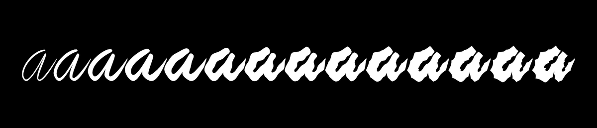
How it will change is up to the font’s designer. Maybe dragging the slider will fatten up the shapes, or maybe it will make them lean forward, or maybe the shapes will begin to repeat and fan out like a slinky. Any way you shake it, the premise is the same: once you’ve moved the slider, the font will change, and at every point on that slider, there is a new variation to be found. So no longer is there a “Regular” and a “Bold” of a font. Now there are a 1000 variations.
Why is this exciting? There are different reasons for different people; matching the weight between two different fonts could be a good reason; adjusting the width of a word to fit a given space is another good one; the list goes on. But for me the appeal of variable fonts is clear-cut: if a font can change, it can change over time. And changing something over time — well, that’s a speciality of ours here at Goodhertz. (And we’re also quite familiar with sliders.)
Another way to put that: a variable font is a font that behaves a lot like an audio plugin. Whenever you change a slider in one of our plugins, you get a new sound, and the possibilities are endless. (Usually variable fonts don’t allow quite as much latitude in their shapes as our plugins do in their sounds, though I’m sure in the future there will be some variable fonts with close to the number of controls in a Goodhertz plugin.)
All in all, matching a variable font with an audio plugin has always seemed to me like a natural pairing, which is precisely why those big words ended up right smack in the middle of Tupe.
It’s also why you’ll often see variable fonts in our ads (this like this one and this one, and also this one) — being able to change the shape of a letter over time is such a perfect analog to changing a sound over time, I just can’t resist adding the effect to so many of our videos.
In fact, we do it so much, we ended up releasing an open-source library called Coldtype to help you make variable font animations of your own.
If you’d like to know more about variable fonts, check out v-fonts.com. If you’d like to animate variable fonts, check out Coldtype, or this list of some of my favorite variable fonts. And if you’d like to know more about James Edmondson, check out OHno Type Co, or watch this rarely-seen video from way back in 2016 (the first and only installment (so far!) in our “What is a plugin?” series).