The True Story of Megaverb
Shortly after its release, this video and its typography were featured on the site Fonts In Use.
About a year ago, around a bonfire, I ran into Devin — co-founder of Goodhertz — at a friend’s party at the top of a hill in Northeast Los Angeles. I knew Devin had made plans to pick up an old digital reverb unit earlier that day, but I hadn’t talked to him since. Now, as he sat there, staring into the fire, I could tell that he must have quite a story to tell.
So I asked him about it, and the details captivated me: the house he had just been to in the San Fernando Valley; the owner, dressed all in black; the owners’ many cats; the reverb unit itself, and its broken controls (though — thankfully — it was still possible to control the machine via MIDI, a task Devin had just been busy with, before he pulled himself away to come here and sit at this fire).
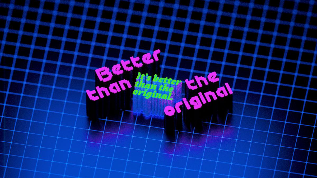
Within the space of a couple weeks, that digital reverb’s unique sound began to come back to life in the Goodhertz codebase, first as a small addition to Lossy (is there anything better than heavy reverb paired with heavy compression?), then as a plugin itself, Megaverb — the quintessence of “bad” 1980s digital reverbs, improved and updated, and available for Mac and Windows.
Around the time that we released that plugin in the fall of 2018, I wrote up the true story of Megaverb’s origins as Devin had related it to me all those months ago on the top of that hill. Then we hired an actor, Tobin Mitnick, to come by our studio and narrate the true story, which he did, and the audio was incredible.
And then it fell to me to make a video out of it.
Making the video
Attempt #1
At first I thought it’d be a simple kinetic typography video — words pop onto the screen as they’re being said. It’s a format I enjoy, and one that would utilize some research I’d recently been doing on making videos with DrawBot.
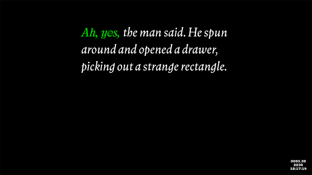
But after a week or two of working on it on-and-off, that idea never quite left the ground. Then it was the holidays and the idea gathered dust.
Attempt #2
Months later, after making a number of videos for our Pi Day sale, this time using a combination of DrawBot and AfterEffects, I tried that idea again: a simple text-based video, using (mostly) fonts from the 1980s.
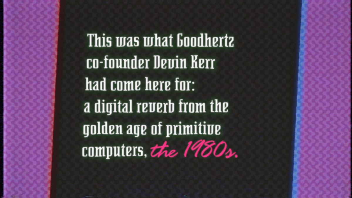
This time around I managed to finish a full draft, along with a simple synthesizer score, which I sent to Devin, who punched it up with some synth flourishes and sub-bass rumbles.
Still the video was not quite there.
I should point out that I have a very high tolerance for text; for me, it can be quite thrilling to watch words pop onto a screen, even in simple paragraphs. But something I’ve learned over the years is that this puts me in the minority of humanity, and everyone I showed the video had the same reaction: it’s interesting, but it’s missing something.
Maybe there could be out-of-focus footage of an actual ranch house in the background, or footage of an actual digital reverb unit? I could almost see that working, but not quite. Should we film an actor spinning around to pull a power supply from a drawer? That didn’t seem possible, at least not without changing the tone of the video altogether.
Attempt #3
What if it was illustrated instead? Maybe in a Tron-esque style? That way we could bring both the concrete scenes of the story and abstract ideas of the narration to life in three-dimensional form.
So, looking for an excuse to dive into the recently-updated Blender 2.8, I set out to put together a proof-of-concept scene: the ranch-house in the San Fernando Valley.
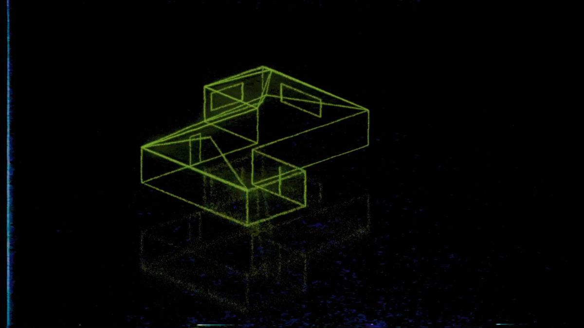
Closer! Within a week I had put together eight more illustrations, culminating in a scene of the sounds themselves, appearing as gigantic words set in the classic typeface Rage Italic (which you may recognize from the current California license plates). (Also, I should note that this scene is an homage to the early 90s Regal Cinemas roller coaster intro sequence.)
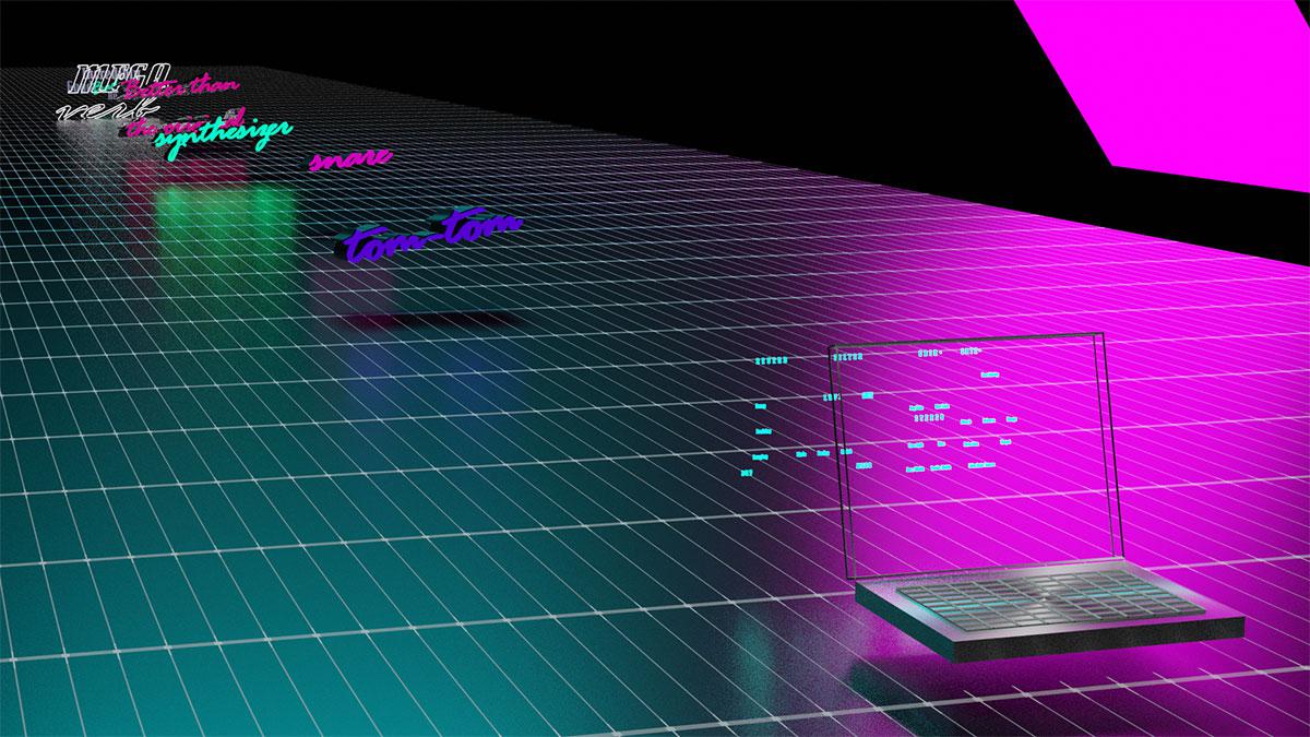
Once that was all stitched together in After Effects (aka yesterday), I sent it to Devin for a final mix and a few more sonic punch-ups (a whoosh as you pass through the first Goodhertz logo; Devin’s inspired bass-drop at the very end), and now it’s Wednesday and I’m writing this blog post and tomorrow — the date on this post — is when we release(d) this video. We hope you enjoy it!
You can listen to the soundtrack on SoundCloud here.