A Ten-Year-Old Web Design
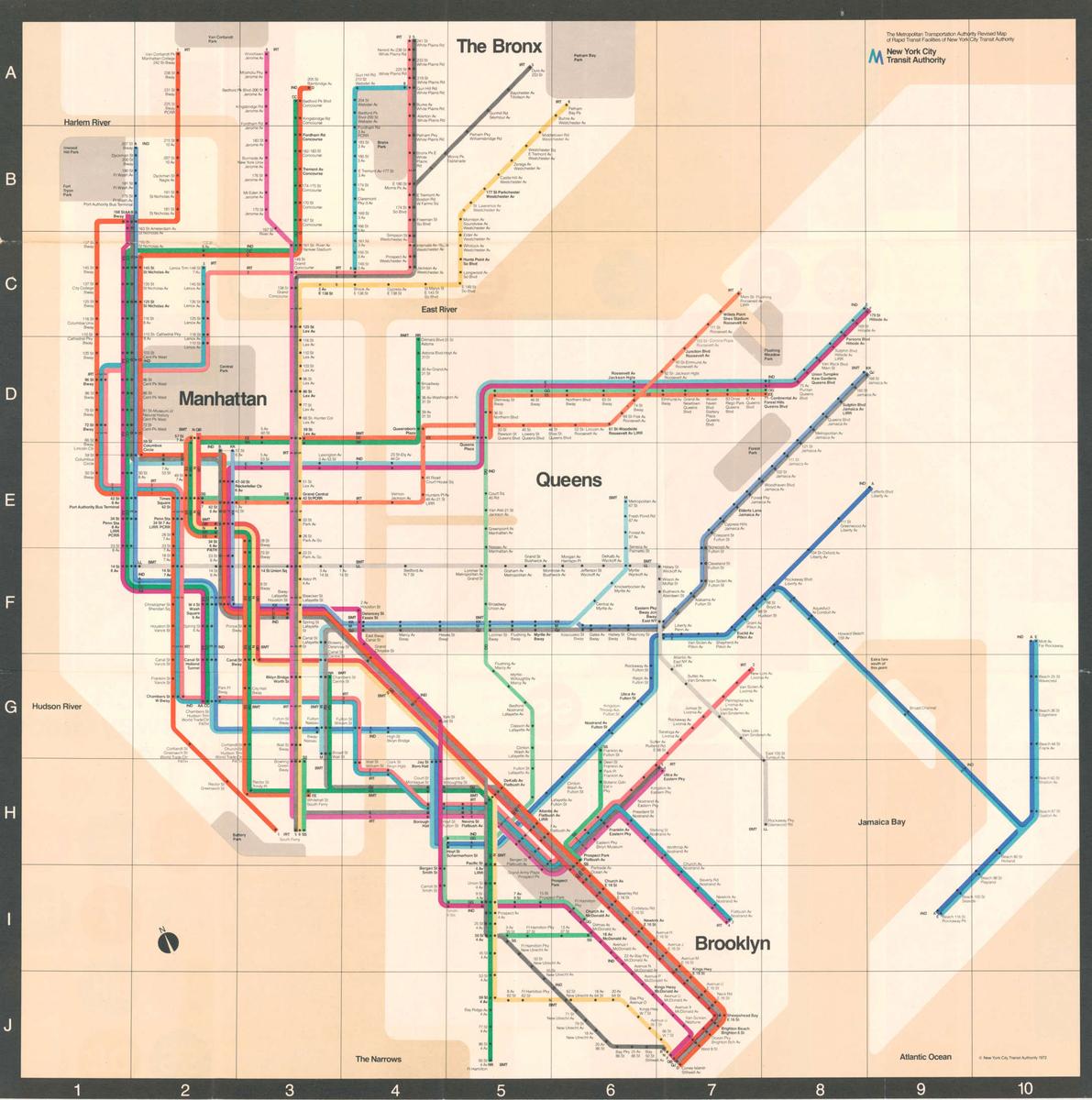
Ten years ago, when we first launched Goodhertz as an audio plugin company, we needed a website. And back then, I — like many in their late 20s — had entered into a minimalist phase. Looking back, it was a little overdone. Did every single plugin logo need to be done in the same typeface? Many typographic modernists would say yes, especially those who specialized in wayfinding graphics, which have always been one of my biggest influences: those overarching typographic systems you find in subways, airports, highways. Isn’t it thrilling to see a typographic vocabulary developed and then lived in across a broad geography? If you’ve ever looked at Goodhertz plugins and thought, huh, this kind of reminds me of the 1970s Unimark-designed map of the NYC subway, you wouldn’t be wrong!
Bright colors, tightly-spaced Helvetica, rectilinear geometry — it’s all there in the original 2014 design of goodhertz.com.1
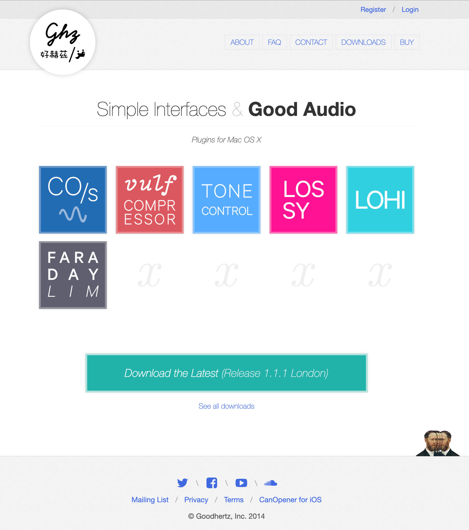
Even that weird little logo at the top, which presents the original “Ghz” logo in English, Mandarin, and Arabic — that could easily be a transit sign somewhere in Queens, New York or Glendale, California. Of course, that logo was a short-lived, probably culturally-insensitive relic of an earlier time (though did point to our later expansion of the plugins interfaces to include translations into a number of languages, Mandarin and Arabic among them).
In short order, by late 2015, the logo was subbed-out for a more straightforward one, and the whole site took on this slightly modified appearance:
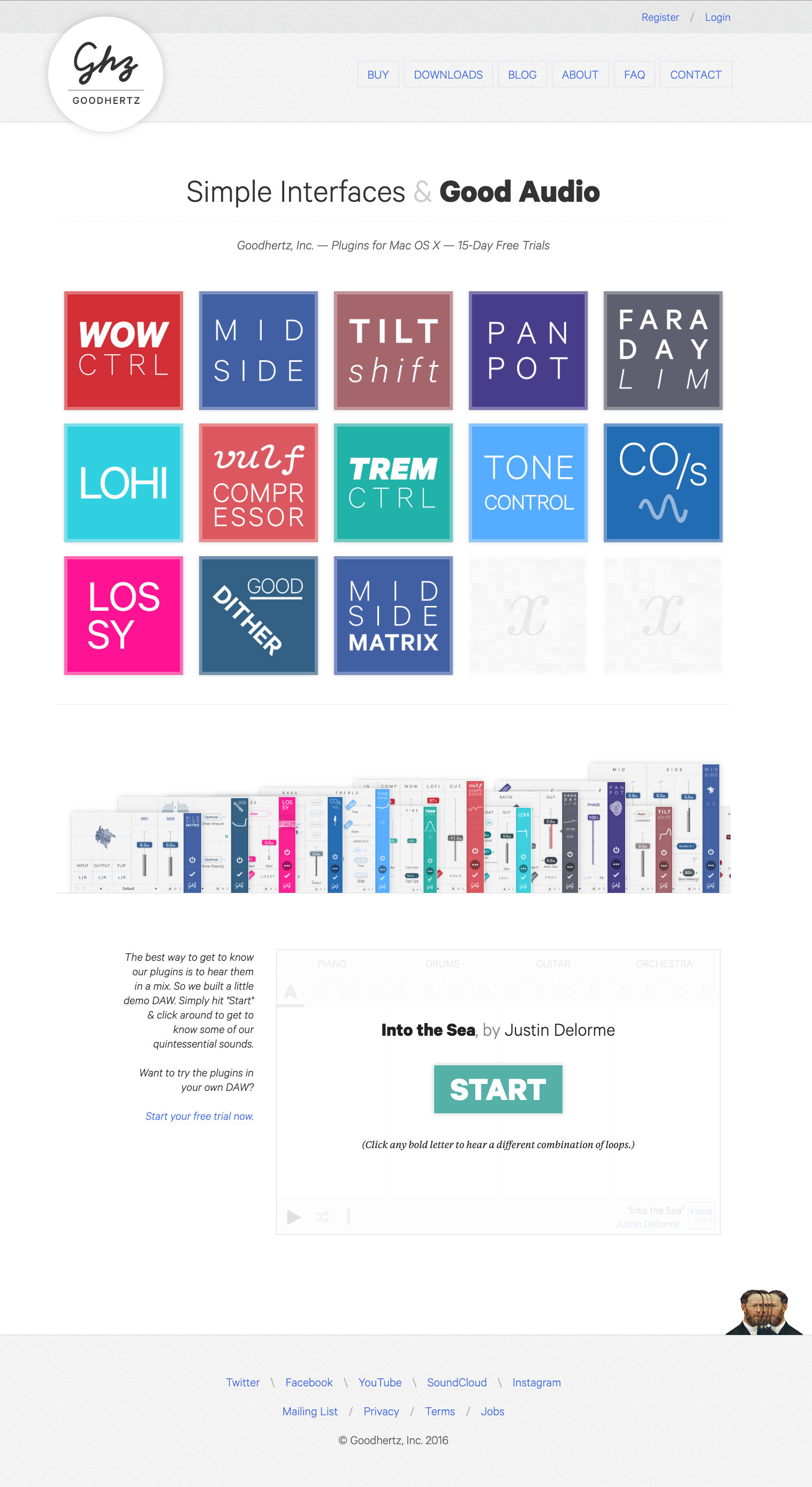
This is the one I think of when I think of the original site design: the Ghz over Goodhertz logo; Calibre everywhere instead of Helvetica; a weird little skyline of plugin interfaces; an embedded Fourloops interface (keep an eye out for a Fourloops revival later this year…), etc.
It was bone-dry in some ways, but true to the original vision of the plugins themselves: a limited graphical vocabulary for a modular approach to software development.
Over time the plugins themselves began to change a little as my taste for strict minimalism abated. Soon each plugin had its own typographic palette. Then Megaverb got a gradient in the sidebar, Tupe went crazy with variable fonts, and Loudness got the full sketchy treatment. I wouldn’t go so far as to call it Postmodern (we’ve never gone skeuomorphic after all), but the newfound looseness in the plugin designs led to something even groovier on the website, which is how we ended up with this design:
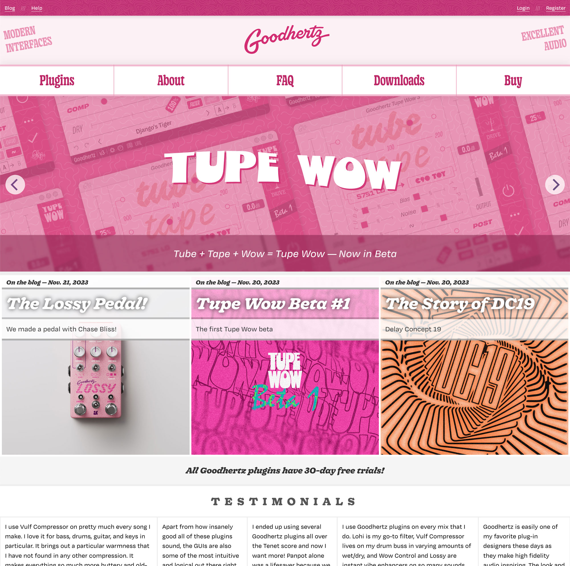
Here the fonts — chief among them Ohno’s Degular and Very Cool Studio’s Gooper — got a little funkier, and everything got more colorful, and we had fun with it for a while, all the way from 2020 to just last week in 2024.
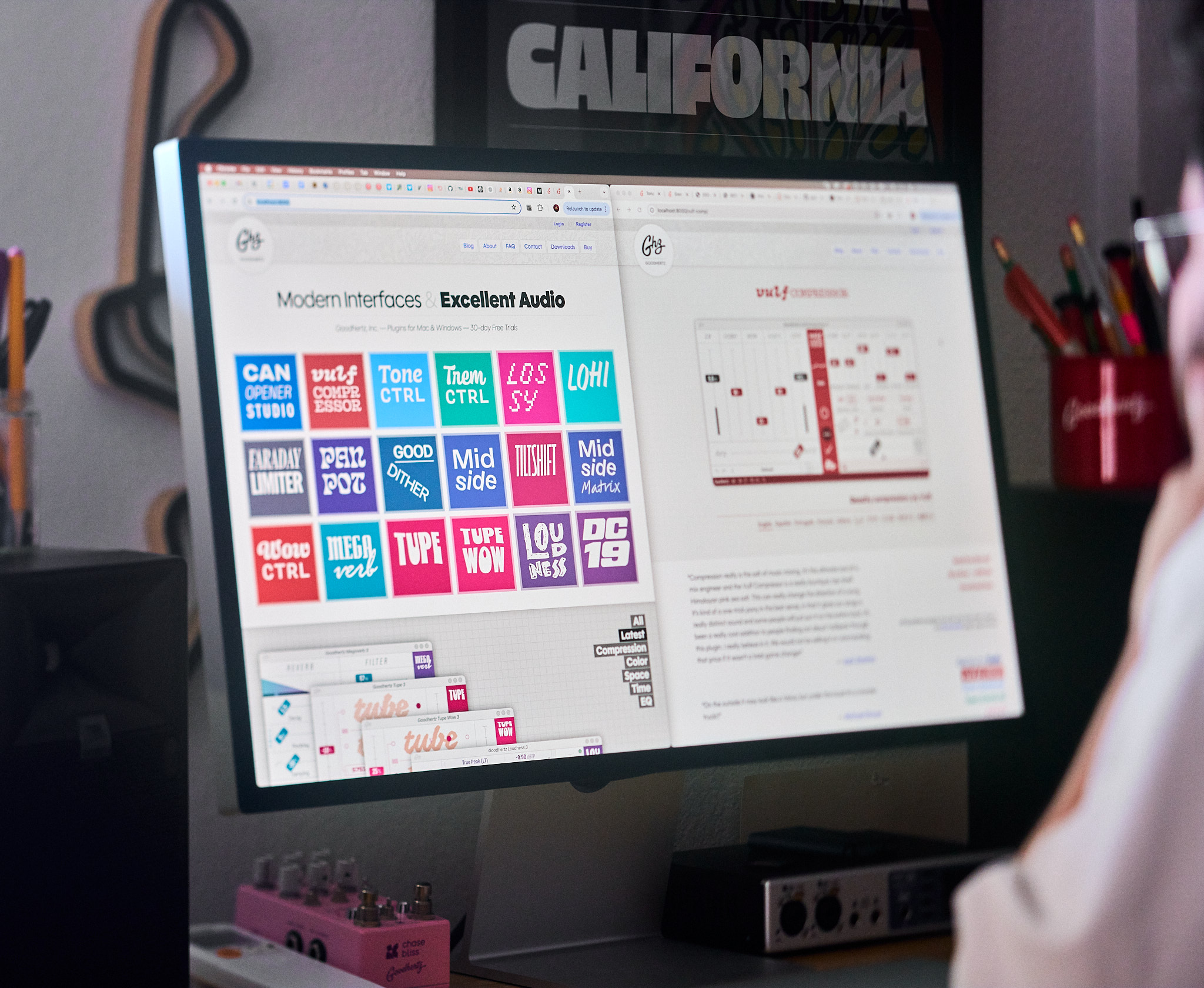
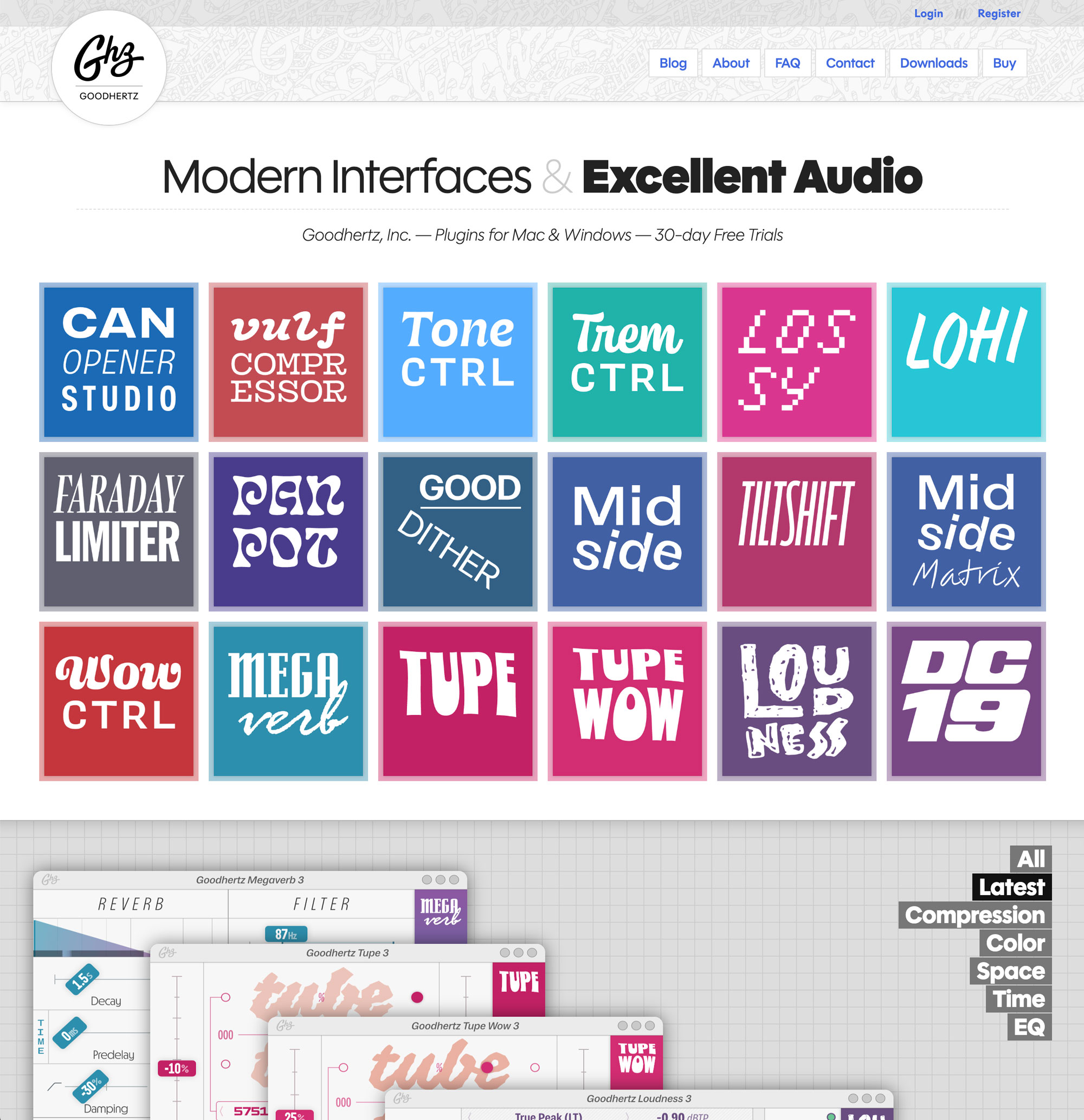
But now, as we’ve been contemplating our 10 year anniversary, I started to wonder: what would our site look like if we had stuck to that original design? I think part of the motivation was Ohno releasing Polymath, an incredibly cool font that has a little of the vibe of our 2014 font (Calibre), but imbues the geometric genre with that unmistakably smiling energy Ohno can’t help but bring to all of their catalog.
Also it’s a variable font, which is awesome.
So that was the first step: stripping down our 2020-2024 design, replacing all the fonts with Polymath, then taking a step back and thinking: this looks good to me.
The next step was updating the weird interface skyline to be, instead, a section that lets you drag the plugin interfaces around just like you would on your desktop DAW. (More coming in that section in the future.)
And… that’s basically it! We don’t know how long we’ll keep this exact design (my wife looked at it and said, “It does look like it’s from ten years ago”), but for at least the rest of this year, this retro-modern-nostalgic look will stay.
We hope you enjoy it!
-
Well, it was actually goodhertz.co back then, because I thought that looked cooler, even though our email addresses were @goodhertz.com. Cooler? Maybe. More confusing? Definitely. We switched everything to goodhertz.com a few years ago. ↩